Weird Cover Colour Combinations (WCCC)

Recommendations, discussions, questions & debates regarding the godly Metal of olde...
User avatar
Khnud
Posts: 2699
Joined: Sat Jun 30, 2007 7:45 pm
Location: Lund, Sweden

Weird Cover Colour Combinations (WCCC)

Post by Khnud »

I might not be a very artsy-fartsy type of person. In fact, drawing was my single worst grade throughout all of my years at school. Nevertheless, I can tell whether a painting is pleasing to the eye, or just makes you wish you'd looked right next to it instead, and really appreciated the texture of the wallpaper. The following covers end up in the latter category.

Crysys - Hard As Rock (Long St Records)
Had this cover been in black & white it would have been great. In fact, any other colour would have been a vast improvement. This reminds me more of an amusement park ad, candy store commercial or child's toy sale sign than a really good hard rock record. The Swedes on the board might notice the similarities between this record and the logo of GB Glace, the largest ice cream company here in Sweden. Maybe that's what bugs me, but probably not. It's just ugly.

Dresden - Too Many Skeletons (Incas Records)
Naughty Venom/Megadeth/speed/thrash/punk crossover kind of music? Check. Evil looking alien/skeleton-looking B-17 airplane on cover? Check. How about we make it purple! With yellow wings! What a great idea! Check! Evilness and naughtiness? Gone. This could have been a great tribute to the cool zombified airplane scene in Heavy Metal (the movie), but turned out to be a prop (pun intended) from a Disney flick instead.

Malibu Barbi - Rude Girls (Neon Angel Records)
I'm not really sure what bugs me about this one. Perhaps it's the fact that the ocean is pink. Or maybe because the mermaid (or is it a mermaid? It's got a human ass by the looks of it. And a g-string! How was that put on?) is white and grey? This is like asking a colour blind kid to do a landscape painting. The sky might as well be green. Dali would be proud!

Image

Sorry about the blurriness, taken by my mobile phone. Feel free to add more WCCC in this thread! We could all do with a good laugh.
User avatar
Cochino
Posts: 1839
Joined: Tue Nov 06, 2007 3:34 pm
Location: Argentina

Post by Cochino »

I love that Dresden cover, I wish I had that record.
User avatar
The Knell
Posts: 4308
Joined: Mon Feb 12, 2007 5:58 pm

Post by The Knell »

Cochino wrote:I love that Dresden cover, I wish I had that record.
I agree!! But it's a pretty cool album too!

Recently my father came to me and asked what the shit is this

it was the full moon live album

Image
is it that bad? well , these are two screaming colors i agree on that...but I think it looks really cool

this one is balls, so stupid that i love it. predator in dense disco lights and a baby blue logo.
Image

colorful demon-asteroid. strange!?
Image

this is my most offensive looking tape!! i looks like a cheap piece of soap!
Image
User avatar
Khnud
Posts: 2699
Joined: Sat Jun 30, 2007 7:45 pm
Location: Lund, Sweden

Post by Khnud »

Knell: That Godzilla album is spot on! I mean, first of all - if you name yourself after this Japanese dinosaur-thingy, why put the Predator on the cover? Godzilla vs. Predator? I'm sure 20th Century Fox would be interested. And the disco lightning is just hilarious!

I know the cover of the Rapid Force tape/album is supposed to be this imposing, raven infested pile of skulls, but it kind of looks like a huge glob of dung with flies hovering above it. Creative use of the colour icky-green too.

Bravo! More!
User avatar
The Knell
Posts: 4308
Joined: Mon Feb 12, 2007 5:58 pm

Post by The Knell »

Khnud wrote:if you name yourself after this Japanese dinosaur-thingy, why put the Predator on the cover?
Typical Metal Enterprises nonsense, I guess :) I like to think that the cover "designer" had no idea what Godzilla is supposed to be and just put up a random wacky looking monster on the cover.
Khnud wrote:but it kind of looks like a huge glob of dung with flies hovering above it.
haha...well that cover was used ridiculously often so i didnt see but you're right...the cheap print makes it look like a mount of sun bleached poo
User avatar
omen of hate
Posts: 6119
Joined: Tue Jul 25, 2006 9:06 pm
Location: Saint Etienne (France)

Post by omen of hate »

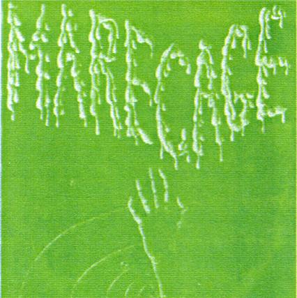
Image

Strange combination of grey and green (or is it white ?), at least, it fits well the band name !
User avatar
Khnud
Posts: 2699
Joined: Sat Jun 30, 2007 7:45 pm
Location: Lund, Sweden

Post by Khnud »

omen of hate wrote:Strange combination of grey and green (or is it white ?), at least, it fits well the band name !
Marécage? My French is actually worse than my drawing skills - but I'm guessing it means swamp. Cover has this Toxic Avenger / Swamp Thing kind of feel about it, so it truly fits the name!
User avatar
Black Axe
Posts: 3098
Joined: Mon Aug 13, 2007 7:49 pm
Location: Too Close For Comfort
Contact:

Post by Black Axe »

Except for the Godzilla cover, I like 'em all. :lol:
User avatar
tbieri
Posts: 769
Joined: Sat Nov 04, 2006 11:14 am
Location: Geneva, Switzerland

Post by tbieri »

Image

The sun in the logo is very ... cute !
Yes, this is Metal ! But not good one !
User avatar
omen of hate
Posts: 6119
Joined: Tue Jul 25, 2006 9:06 pm
Location: Saint Etienne (France)

Post by omen of hate »

Khnud wrote:
omen of hate wrote:Strange combination of grey and green (or is it white ?), at least, it fits well the band name !
Marécage? My French is actually worse than my drawing skills - but I'm guessing it means swamp. Cover has this Toxic Avenger / Swamp Thing kind of feel about it, so it truly fits the name!
Yes, it means swamp.
User avatar
The Knell
Posts: 4308
Joined: Mon Feb 12, 2007 5:58 pm

Post by The Knell »

tbieri wrote:Image

The sun in the logo is very ... cute !
Yes, this is Metal ! But not good one !
Oh god the sun totally ruins it!! Hilarious!
User avatar
Nonseinormale65
Posts: 567
Joined: Thu Jan 14, 2010 6:55 pm
Location: Italy

Post by Nonseinormale65 »

tbieri wrote:Image

The sun in the logo is very ... cute !
Yes, this is Metal ! But not good one !
One of the worst band ever come from my country,strangely they are still active but Alex Moschini(the bass player and the only original member of the first line up)despite of several misfortunes has never gave up the fight :shock:
Solo i morti hanno visto la fine della guerra.
User avatar
Sammi Curr
Posts: 139
Joined: Tue Aug 04, 2009 12:14 am
Location: Detroit, MI
Contact:

Post by Sammi Curr »

Image
User avatar
tbieri
Posts: 769
Joined: Sat Nov 04, 2006 11:14 am
Location: Geneva, Switzerland

Post by tbieri »

Image
User avatar
Cochino
Posts: 1839
Joined: Tue Nov 06, 2007 3:34 pm
Location: Argentina

Post by Cochino »

Image
Image
Haven't heard these albums so I don't know if they're really Heavy Metal or more Hard Rock.

Oh, and another one from around here
Image
Post Reply