Page 2 of 3
Posted: Tue Oct 16, 2012 12:47 am
by Speedeceiver
Posted: Tue Oct 16, 2012 11:23 am
by Ernest Thesiger
Posted: Tue Oct 16, 2012 3:55 pm
by Herkus Monte
Impressive...
Posted: Tue Oct 16, 2012 4:04 pm
by ION BRITTON
Posted: Tue Oct 16, 2012 4:06 pm
by ION BRITTON
One of the best...

Posted: Tue Oct 16, 2012 5:06 pm
by Nightcrawler
Posted: Mon Oct 29, 2012 12:45 am
by CloudsOfMetal
Silly name but really nice logo.
Posted: Tue Oct 30, 2012 1:40 am
by Ryür
ION BRITTON wrote:One of the best...
I hang a picture taken of my t-shirt


Posted: Tue Oct 30, 2012 6:29 am
by Trigger
CloudsOfMetal wrote:Silly name but really nice logo.
The name was silly because their lyrical content was intentionally silly as well.
Posted: Tue Oct 30, 2012 12:36 pm
by CloudsOfMetal
Trigger wrote:
The name was silly because their lyrical content was intentionally silly as well.
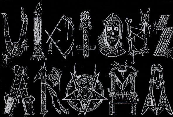
Yes, aromatic viciousness in every aspect. Also I love that Gotham City logo which is posted above. I've never tried vectorizing images yet, but maybe I should try that on that logo. It would look even more gorgeous without the blocky edges and small resolution.
Posted: Tue Oct 30, 2012 4:55 pm
by CloudsOfMetal
It's difficult to deal with the pixelation in a proper way with a logo as complex as this without losing the authenticity but here it is.

Posted: Thu Nov 08, 2012 9:33 pm
by Fire Down Under
Posted: Thu Nov 08, 2012 11:43 pm
by The Knell
are you serious? that tripod logo isn't very good...
Posted: Fri Nov 09, 2012 1:37 am
by MEXDefenderOfSteel
The Knell wrote:are you serious? that tripod logo isn't very good...
Aah u beat me to say that

Posted: Fri Nov 09, 2012 5:58 am
by daniel